Home of Powerhouses
BILL! is a leading force in the heavy-duty machinery and vehicle industry, offering solutions that are built to last and perform in the toughest conditions.
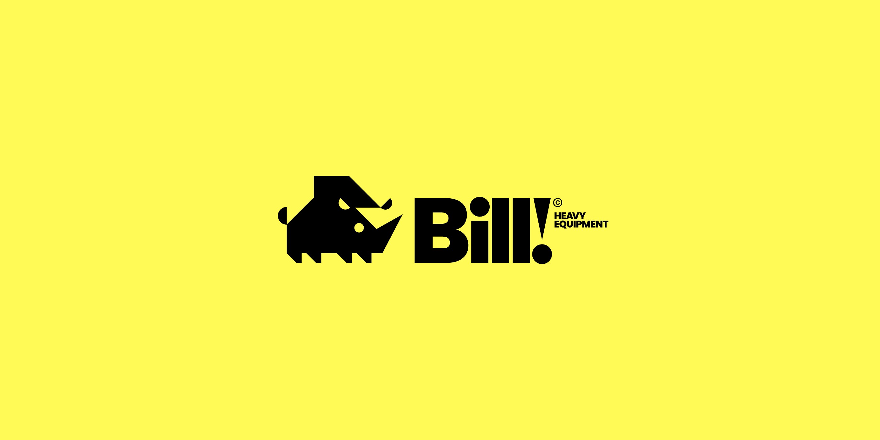
Logotype & mark
The logo mark is a minimal and geometric depiction of a rhino. Its angular lines and bold form create a dynamic image that conveys both power and precision, aligning with the company's commitment to delivering high-performance, durable machinery. The rhino, known for its formidable presence, symbolizes the robust and reliable values that lie at the heart of BILL!’s brand identity.
This powerful animal calls for an equally powerful logotype. The design originates from the Poppins typeface but has been customized to capture that same clean, bold, and heavy-duty look.
Client:
BILL!
Category:
Heavy-duty machinery
Project:
Visual Identity / Art direction
Location:
Deadwood, South Dakota