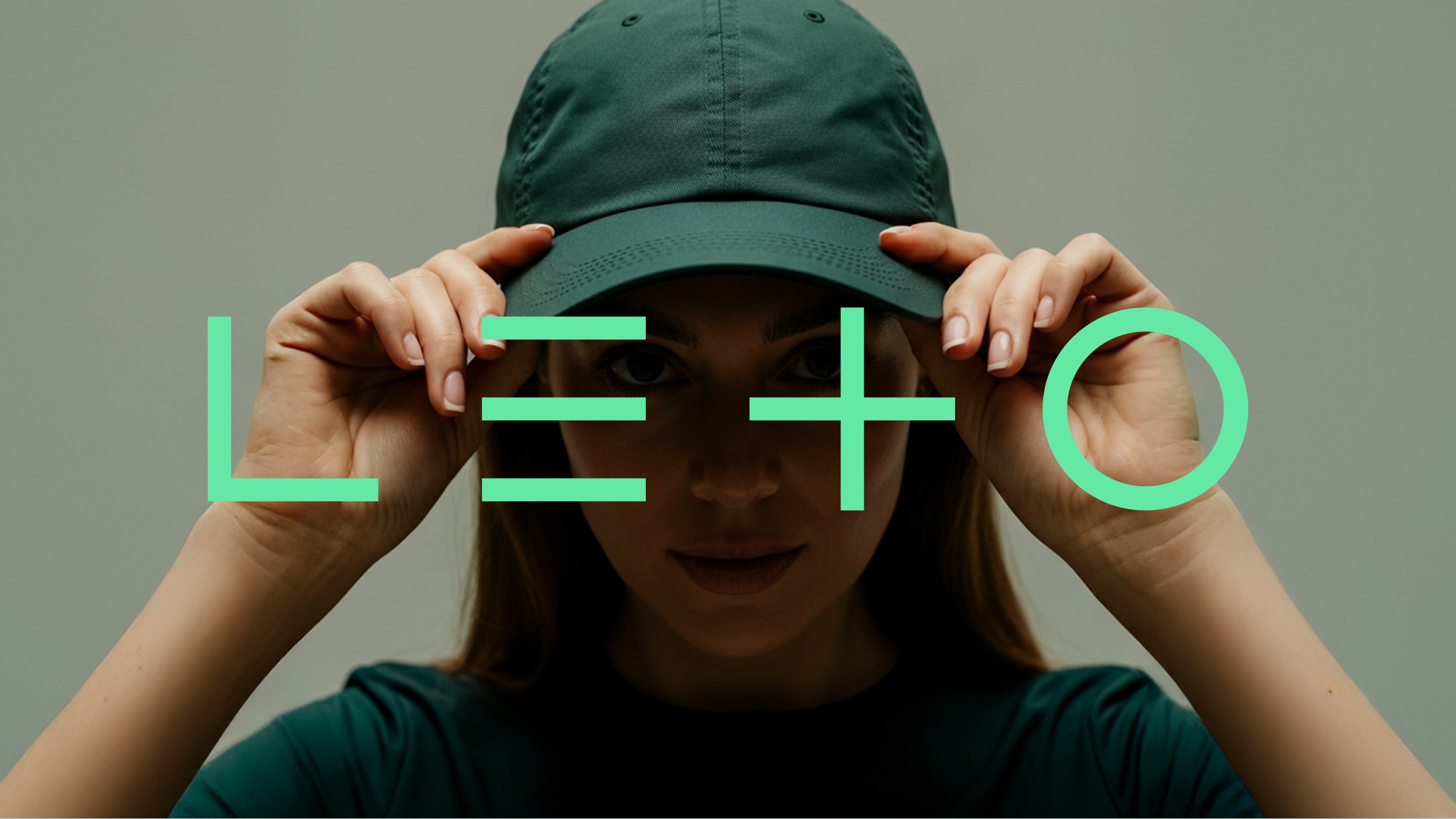
Care that fuels growth

Leto thrives on four core pillars—Growth, Nurture, Connection, and Joy. It’s a place where people push past limits, support each other, celebrate progress, and discover the thrill of movement. The brand identity needed to capture that energy: welcoming and full of life, yet with a minimal appearance to symbolize the no-nonsense training environment.

The identity centers around a minimal logotype that cleverly transforms into a collection of flexible symbols. Each symbol reflects the gym’s core values and can be used across all brand touch points. This modularity reinforces the brand’s adaptability— just like the athletes themselves.

Client:

Leto

Category:

CrossFit

Project:

Visual identity, Web design

Location:

The Hague, The Netherlands

Woman with cap and logo
Man lifting barbell
Man lifting barbell
Man lifting barbell
Shirt and stance
Shirt and stance
© Selected Works
(DSGN® — 02)
Brand Designer
© Selected Works
Brand Designer
© Selected Works
Brand Designer
© Help Center
(FAQ — 01/06)
Clarifications
© Help Center
Clarifications
© Help Center
Clarifications

FAQ.

FAQ

01

What services do you offer?

02

What is your typical turnaround time?

03

What industries do you specialize in?

04

What are your prices?

05

Do you offer brand strategy too?

06

What's your favourite movie?

What services do you offer?

What is your typical turnaround time?

What industries do you specialize in?

What are your prices?

Do you offer brand strategy too?

What's your favourite movie?

What services do you offer?

What is your typical turnaround time?

What industries do you specialize in?

What are your prices?

Do you offer brand strategy too?

What's your favourite movie?